Pleas for data visualization
The R code for the following sections is also available as plain .R scripts. If you downloaded the ZIP-file and you view this as a PDF-document, you find the .R files in the same folder as this document.
Numbers tell only a part of the story
To illustrate why data visualization is useful, let’s look at two examples. Below, we read some data from a CSV-file.
some_data <- read_csv("data/some_data.csv")# A tibble: 142 x 2
x y
<dbl> <dbl>
1 55.4 97.2
2 51.5 96.0
3 46.2 94.5
...As you can see, the data contains two variables x and y with 142.
If we didn’t have visualization as a tool in our data analytics toolkit, we could try to get some insight into the data with descriptive statistics. For example, we could calculate the mean for both variables:
some_data %>%
  summarise(across(everything(), mean, .names = "{.col}_mean"))
Similarly, we could calculate a measure of spread, such as the standard deviation:
Or other measures:
We could also calculate Pearson’s correlation coefficient:
From the rather small value, we could hypothesize that the variables are unrelated. But are they?
Visualization can reveal hidden patterns
Let’s add visualization to our toolkit and find out:
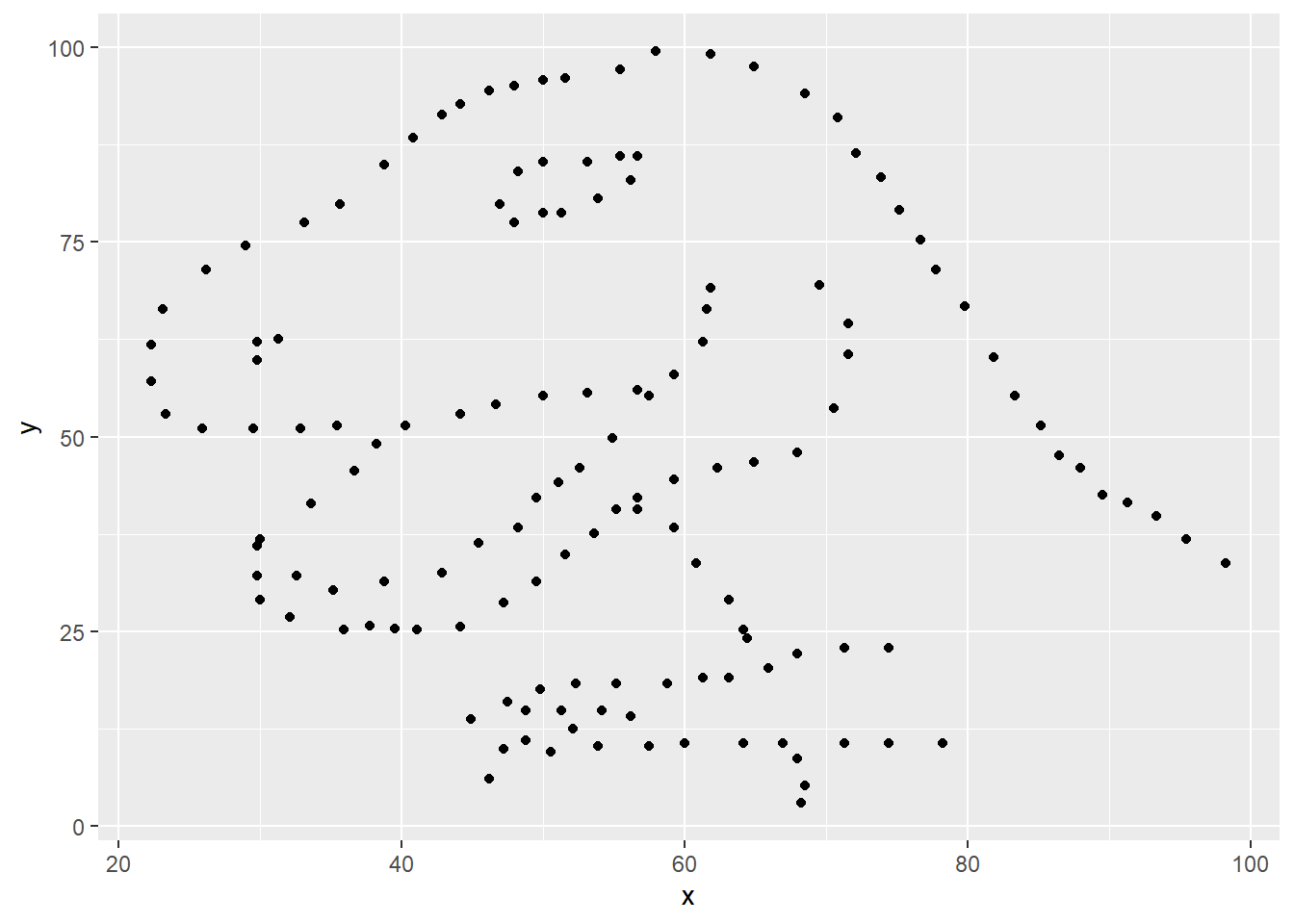
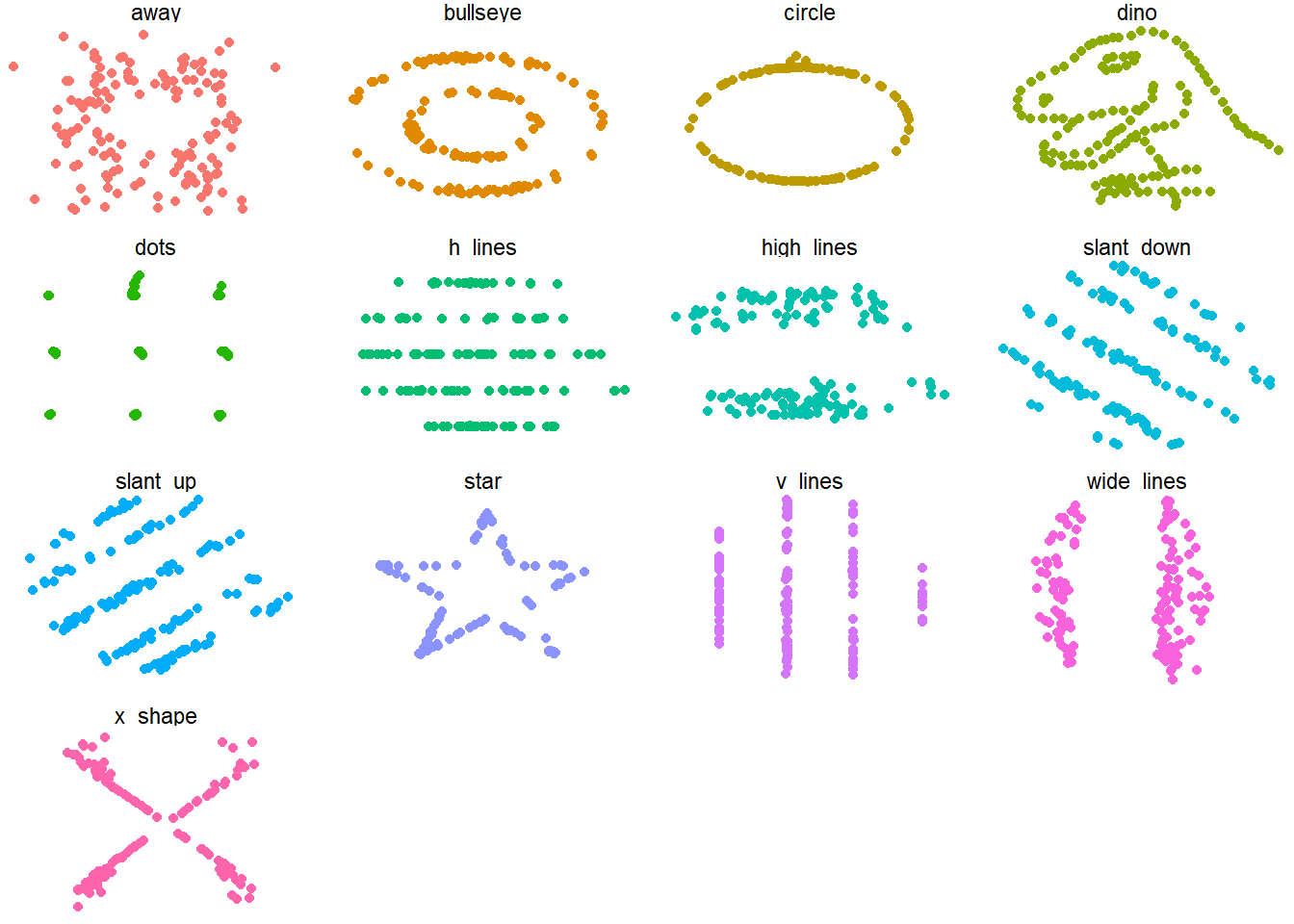
The data certainly does not look unrelated to me. Obviously, this is an exaggerated example, but it makes the point: Only when we visualize data can we identify patterns that would otherwise stay hidden in the numbers. No statistical method could have told us there is a dinosaur hidden in the data. Well, actually it is called a datasaurus, and there is a whole R-package with the name datasauRus dedicated to it. This package contains the same data set, but adds more that share the same statistical measures. We could not distinguish between the data by just looking at measures such as mean, standard deviation or correlation coefficient. We would have to visualize the data:
The table shows the mean, standard deviation and correlation coefficient for all 13 data sets included in the datasauRus package. As you can see, the values are nearly the same across all data sets. Only when we visualize do we see the different patterns in the data:
Anscombe’s Quartet
Another and even older plea for the visualization of data can be found in Francis Anscombe’s publication Graphs in Statistical Analysis from 1973. In his paper, Anscombe presents four data sets that look very much the same when viewing the common descriptive statistical measures. Again, only by visualizing the data can we see the otherwise hidden patterns.
Let’s load the data and see for ourselves:
For convenience, we want all four of Anscombe’s data sets in one data frame. We can achieve this with the union_all() function:
We now have all four of Anscombe’s Quartet in one data frame, and we can distinguish the original data set by the column dataset. First, let’s look at the descriptive statistics:
As expected, all measures look the same for all 4 data sets. But again, a plot reveals the truth:
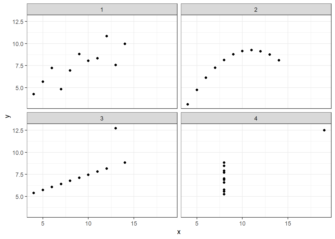
The first plot shows a linear trend with some noise, as we might already have suspected from a correlation coefficient of roughly 0.81. The second plot, although having the same correlation coefficient, displays a non-linear trajectory. The third plot would have had a perfect correlation if it wasn’t for the single outlier. In contrast, the last plot would have had no correlation between x and y, if the point on the very top-right didn’t exist. Again, we could not have gotten this insight from any statistical measure we can calculate.
I hope the examples convinced you of the importance of data visualization. There are even more good reasons why we should visualize data, besides revealing hidden patterns. We know from psychological research about the way humans process information that visualizations are a much faster way into our brains. We can not only grasp what we see in a good data visualization faster, but also comprehend it better and create a better memory of it. If that doesn’t convince you, nothing will.
References
Last updated